Gray Construction Website Redesign
A construction firm that outgrew its identity. A new brand architecture, service platform, and digital experience built to match.
00

problem
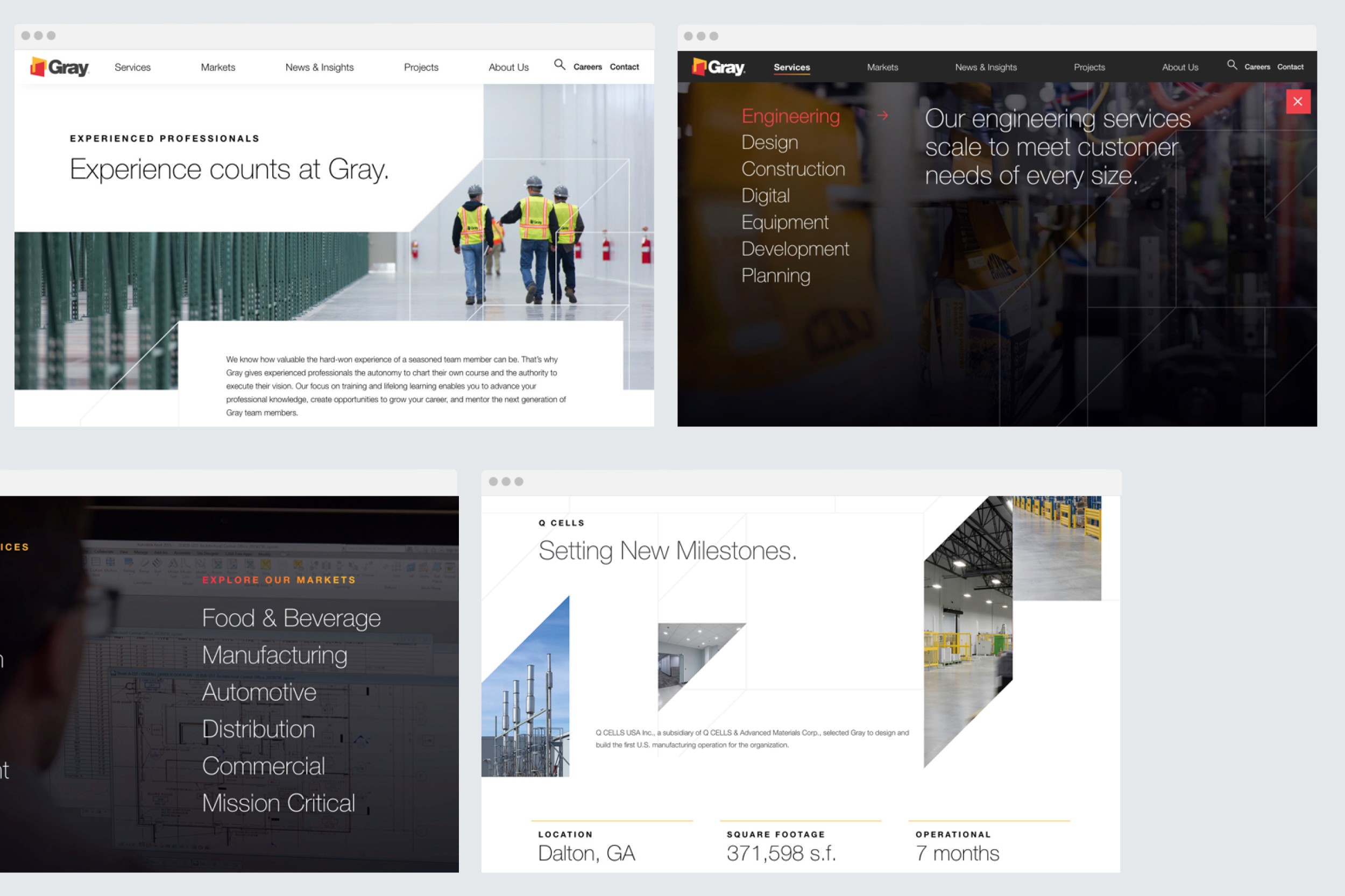
Gray had outgrown its identity as a traditional construction firm. Through a series of acquisitions and innovations, particularly in Food & Beverage and Smart Manufacturing, the company had evolved into something far more complex, but its brand, services, and digital presence hadn't kept pace. Five endorsed brands operated independently, 290 services were scattered with no clear hierarchy, and the website couldn't tell the full story of what Gray had become.
solution
As part of the One North team, I oversaw and led the redesign of Gray's digital experience from the ground up. Starting with brand architecture, we aligned leadership across five organizations around a single narrative and consolidated 290 services into seven clear categories. From there we built a flexible design system and digital templates that could support the main Gray brand and scale to absorb any acquired business, present or future.
The work started well before any screen was designed. We brought together leadership from five separate organizations and helped them agree on something fundamental: what Gray actually is, and how to talk about it. The answer was relationships. Not a tagline, but a genuine strategic lens that shaped everything that followed.
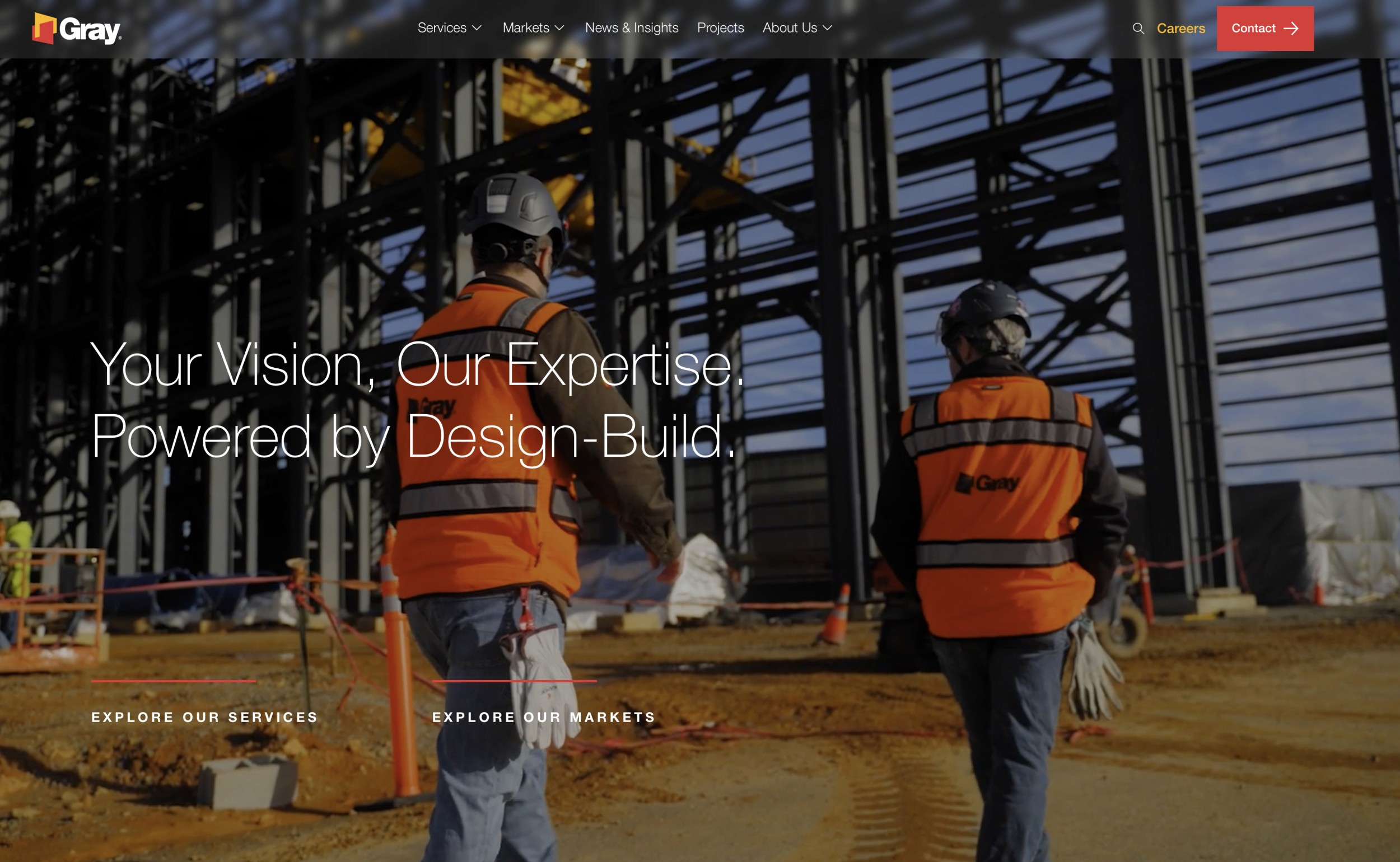
With that foundation in place, we built out the visual identity and brand expression. The color system, the precision of the geometric motifs, the typographic voice — all of it grounded in the industrial world Gray operates in while signaling a company that has clearly leveled up.
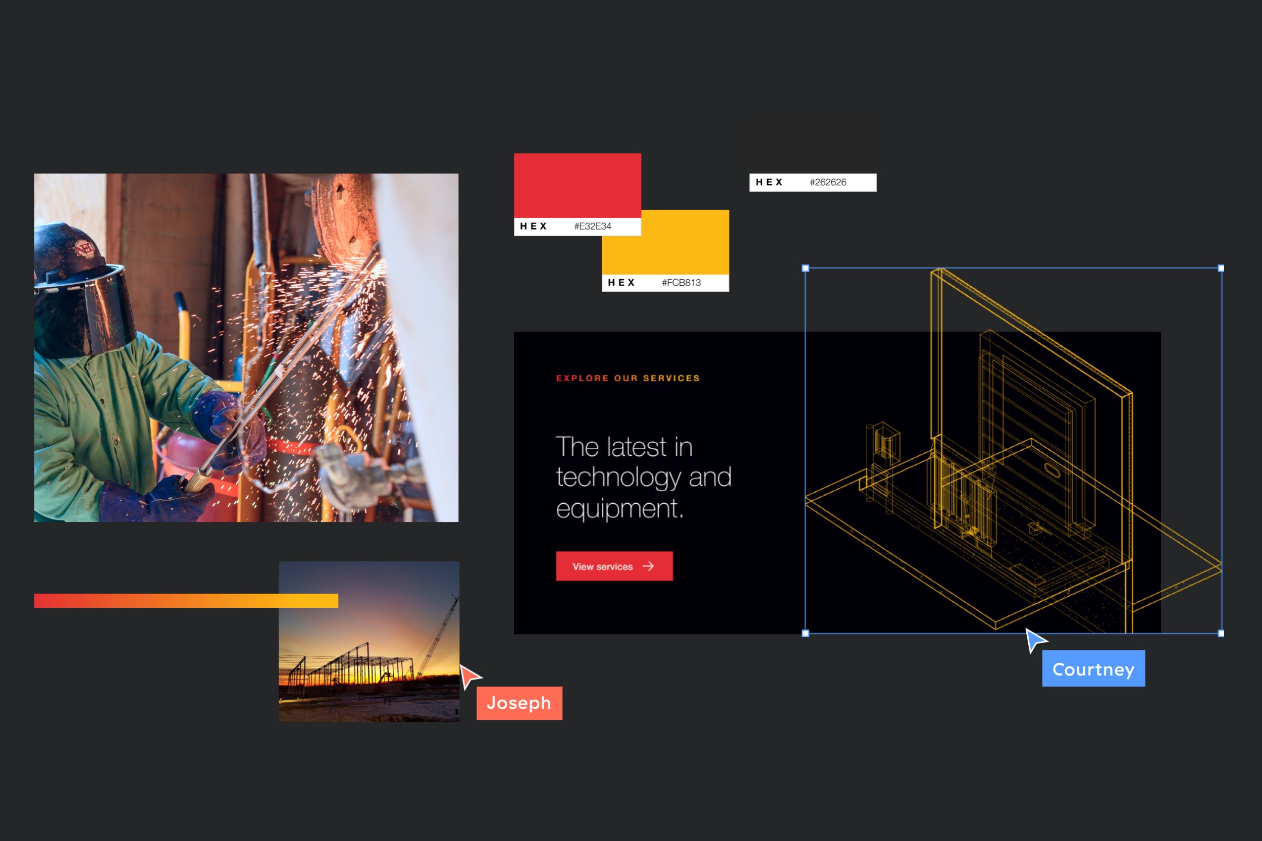
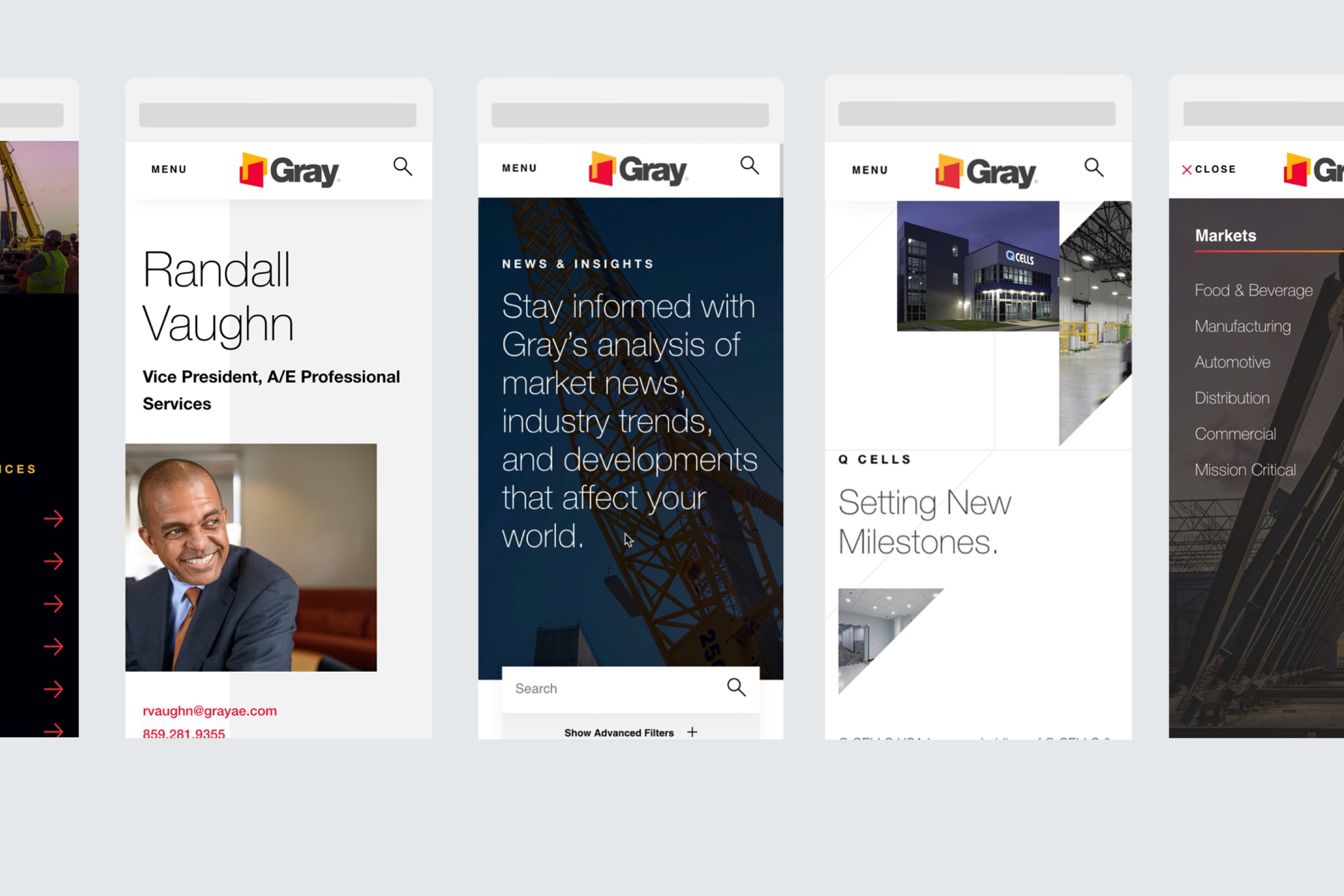
290 services became seven. The navigation architecture was rebuilt around how customers actually think about what they need, not how Gray was internally organized. Services, Markets, Projects, People — each section designed to tell a different part of the same story.
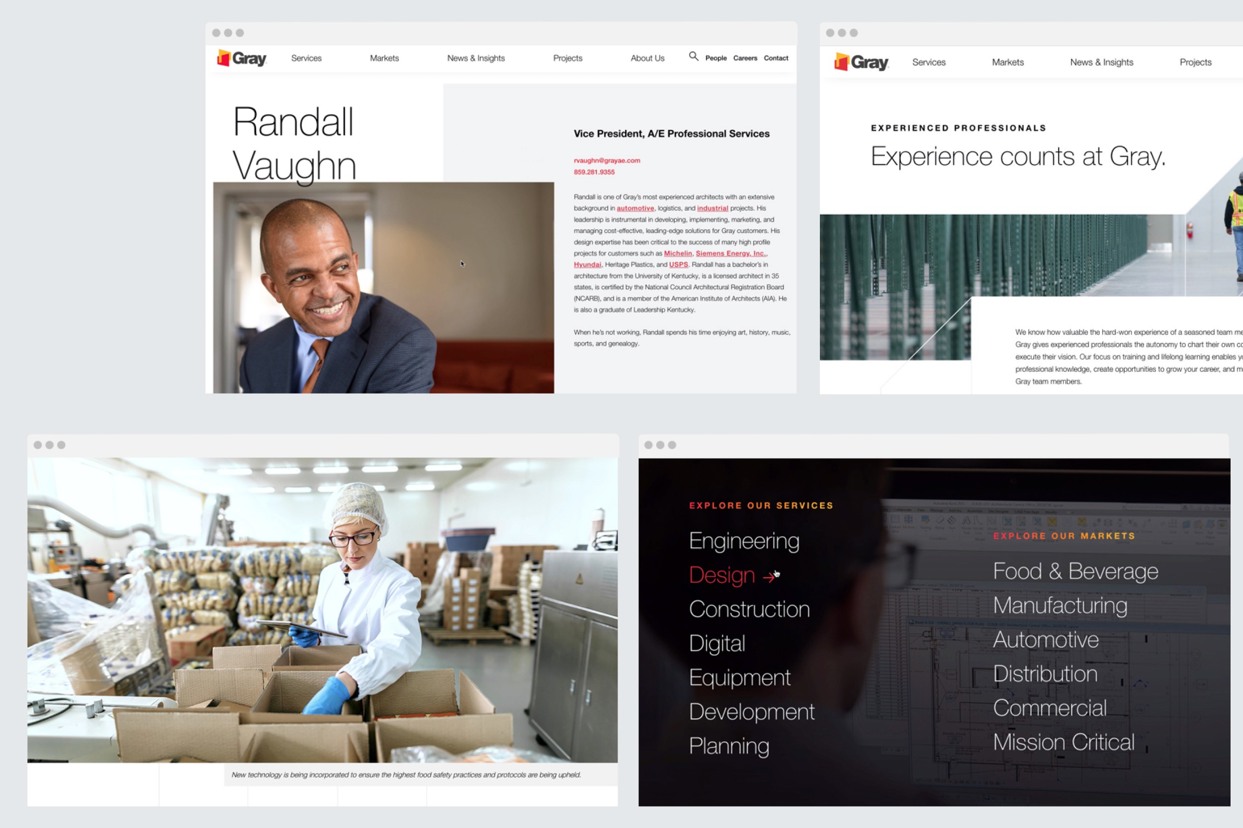
The site needed to work as hard on mobile as it did on desktop, across every content type, from project case studies to people profiles to news and insights.
A flexible design system and templated architecture meant Gray's team could create new assets and onboard acquired brands without starting from scratch. Built to grow.
year
2020
timeframe
1 year
tools
Figma, Sketch, InVision, Craft CMS
category
UI/UX


